An IA pattern designed for one segment, propagated across all five.
I designed the navigation architecture for U.S. Bank's Business Banking redesign — built within the constraints of the bank's existing design system, against stakeholder pushback on touching global nav. The architecture I designed for one segment now anchors all five top-level segments of usbank.com.
The redesign was scoped to Business Banking specifically: 86 pages, a templating system, and a navigation IA grounded in 197 stakeholder and customer interviews plus a 400-person archetype survey. The instruction on navigation was specific. Stay within the existing system, and don't propose anything that would change the site's global navigation.
The architecture.
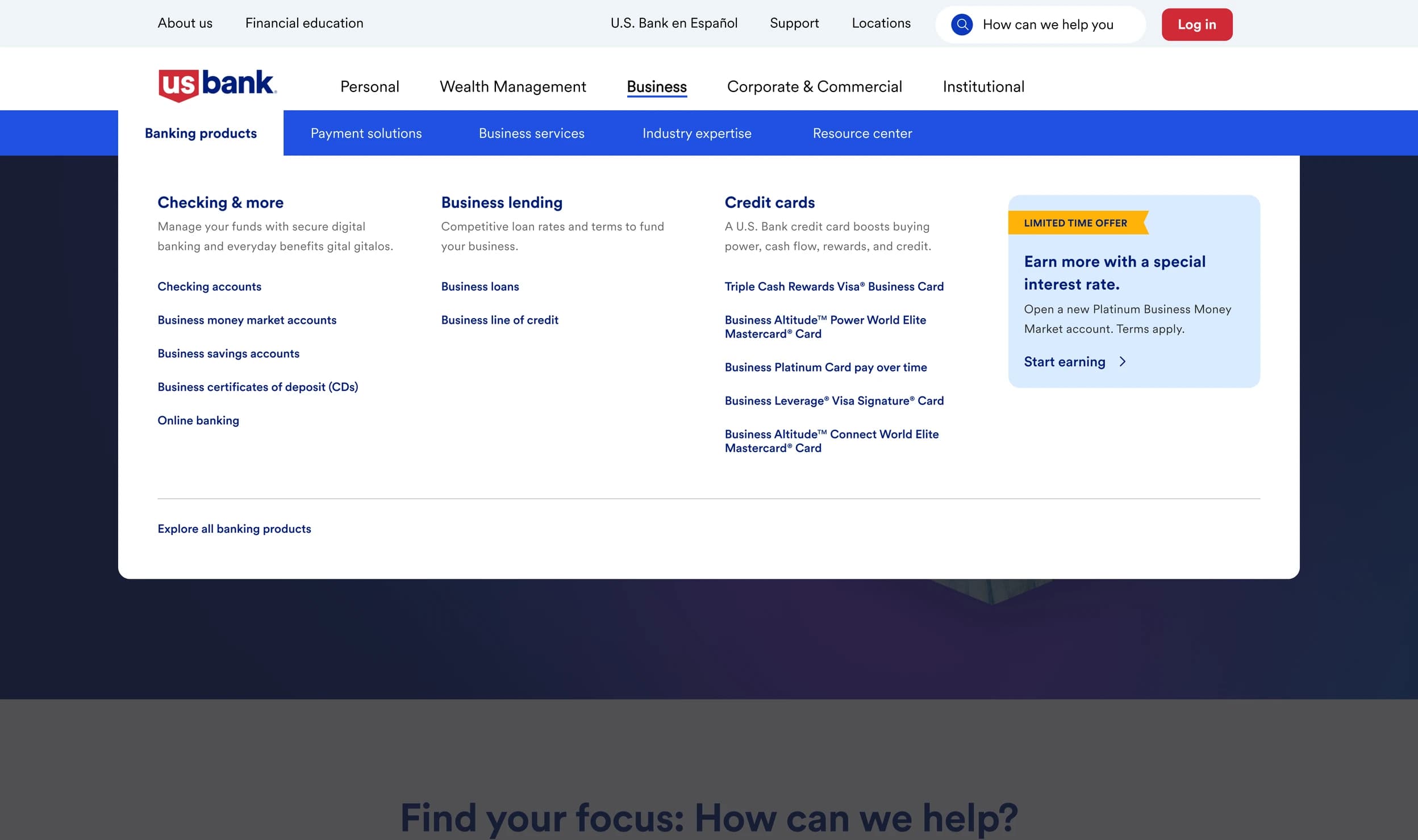
FIG. 01 · Business Banking navigation, parallel-column architecture.
The consequential decision was making the product domains visible in parallel rather than sequentially. The legacy navigation was a two-pane fly-out: pick a category, wait for products to load, scan, back out, try another. The research had surfaced four archetypes navigating the site for different reasons — some comparing products, others validating reputation or researching independently — and a sequential structure forced all of them to use the same hunt pattern regardless of intent.
The architecture replaced that with parallel product columns under a horizontal subsection layer. Three product domains visible at once. Each column anchored by an "Explore all" link for users who wanted depth. A featured-offer panel running as a peer to the product columns, sized for promotional content that stakeholders wanted surfaced at the navigation level. The primary CTA sat at the bottom-left, aligning with the natural scan pattern across the panel.
Designing within the constraint.
My initial proposal was an audience selector in the utility navigation that would reshape the top nav based on the selected segment — an audience-routed shell that would let customers across segments navigate from a top nav tuned to who they were. The stakeholder response was that the bank was not interested in changing navigation globally at that time, and that the work should solve for Business Banking specifically.
So the brief tightened. The pattern I designed was scoped to Business: a navigation panel that lived inside Business Banking and didn't propose changes to any other segment's nav. The structural moves — horizontal subsection tabs, parallel product columns, the right-side promotional panel — were the same ones that would have powered an audience-routed shell. Scoped down, they served one segment. The architecture happened to be portable.
The research that grounded the system.
U.S. Bank's prior assumption was that the primary Business Banking audience was traditional in-person business owners. The research displaced that. Four archetypes emerged from 197 interviews and a 400-person survey: In-Person Enthusiasts (31%), Reputation Seekers (26%), Specialization Seekers (29%), and DIY Researchers (15%). Three out of four led with digitally-driven primary needs; the in-person assumption had been undercounting the customer base by roughly two thirds.
The translation showed up at two scales. At the navigation level, the parallel-columns architecture reflected the finding that the archetypes weren't navigating sequentially through one product hunt but scanning simultaneously across product domains for different reasons. At the page level, the pod I led developed 10 templates and 34 components with archetype-specific compositions: comparison tables for DIY Researchers, testimonials and accolades for Reputation Seekers, industry selectors for Specialization Seekers.
What propagated.
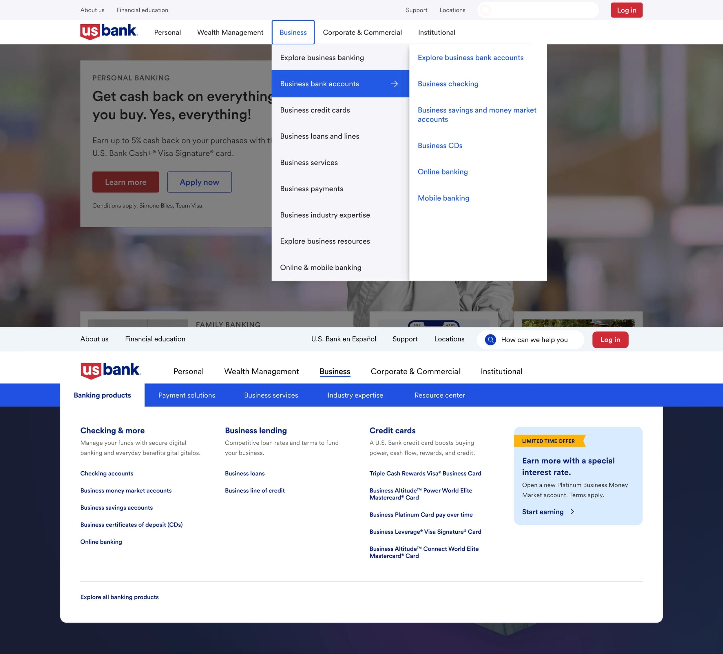
FIG. 02 · Business Banking navigation, before and after the redesign.
The engagement wrapped in February 2025. In the months that followed, U.S. Bank rolled out a new top-level navigation across the rest of the site. The architecture I had designed for Business Banking was carried into Personal, Wealth Management, Corporate & Commercial, and Institutional.
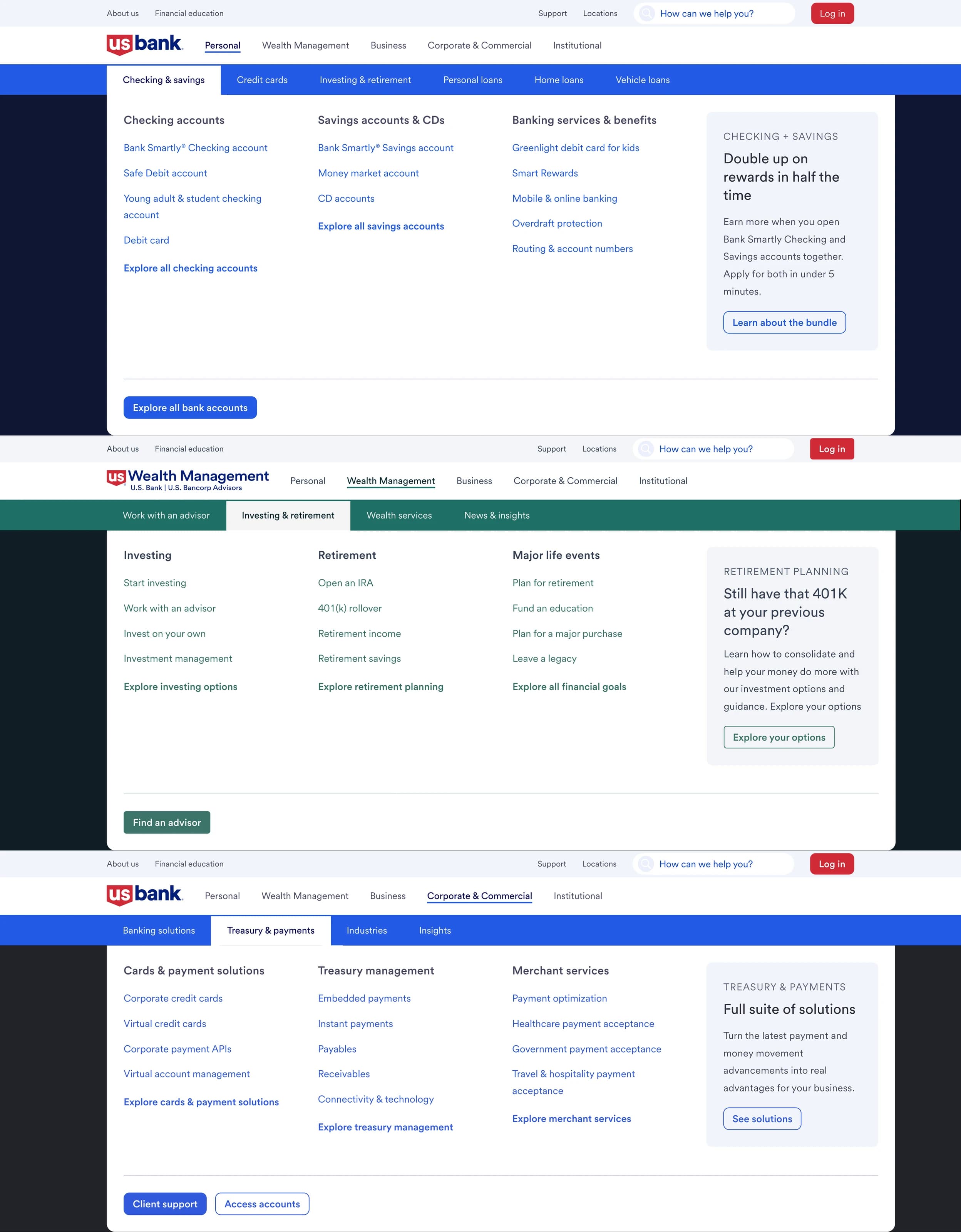
FIG. 03 · Architecture propagated across three of usbank.com's five segments.
The propagation isn't 1:1. Each segment's color treatment and label nomenclature was normalized to its own customer base. What carried unchanged were the structural moves: horizontal subsection tabs, parallel product columns with descriptions, the right-side promotional panel as a peer to the product columns, "Explore all" anchors per column, and the primary CTA at the bottom-left.
Role and scope.
Co-lead designer on the engagement, joined from project kickoff. I worked alongside a counterpart co-lead designer; I drove the navigation IA, from the initial audience-selector proposal through the parallel-columns architecture that shipped. We both reported to an ACD; the engagement was led by a GCD. Under me, a three-designer pod focused on page templates; the counterpart pod focused on visual design and componentization within the existing U.S. Bank design system.
The Business Banking navigation is live in production today, alongside the architecture's propagation across the four other top-level segments of usbank.com. Full case study deck available on request.